BLEACHER REPORT
Happening Now
The Fire tab’s goal is to feature trending content within Bleacher Report, but the algorithm often shows dated content, and engagement with the tab is low. This project aims to redesign the Fire tab to be more engaging for users and to showcase Bleacher Report content in a more valuable way.
As a Product Designer on the team, I led the design process from start to finish. This included gathering competitive analysis and research, creating early concepts, and delivering final designs.
PROJECT TYPE
Mobile App, iOS + Android
Jane Neiswander + Aldina Fazlic | Product Designer
Andrew Burke | Product Manger
Ligja Gill | UX Research Manager
Felipe Gil, Rene Candelier | Engineering
TEAM
TOOLS USED
Figma
Adobe After Effects
TIMELINE
Launched Spring 2022


Users Want An Easier Way to Discover Content in B/R App
Before I joined the project, a fellow designer partnered with our research team to conduct an initial round of interviews with users to understand how they discover content within the B/R app. User research found that users were generally satisfied with the breadth of content available, but they found it difficult to navigate between their declared interests and featured content.
Findings
01
It’s hard for users to navigate to specific areas of interest or to search for content when they are looking for something specific
02
We do a great job of aggregating content and exposing users to a variety of sources in one place but navigating that content can be challenging
03
Users are generally interested in seeing content outside of their interests as long as they have control over when or how they see it.
Aligning on Ways to Display Content
From the initial research results, we determined we wanted to further separate the home tab and fire tab by aligning all content under the home tab to be personalized and for the fire tab to be focused on new trending content in BR.
I started by partnering with the product and programming teams to determine the types of content and hierarchy of how it would be featured on the page.
Drawing Inspiration from Print, Social Media, and Other Apps
Aldina and I partnered to create a vision board for the design approach of the new page in the app. We wanted to focus on a bolder design that would make the visuals (imagery and video) stand out more. We drew inspiration from a variety of sources, including print, our BR social media, and other apps and websites.

Experimenting with Different Concepts
Aldina and I used the wireframes as a starting point to develop design concepts for the new page. We drew from our shared inspiration board to create a variety of concepts, each with its own unique look and feel.
Card Concept

Gallery Spacing

Full bleed
We decided to move forward with the full-bleed concept because we felt it was the most engaging and immersive design. We then began to explore how different content types would look when featured in the spotlight, like tweets, videos, and games.
Experimenting with different content types

While working on the spotlight, we also began iterating on the rooms modules. Rooms was a new feature we were launching, and we wanted to find new ways to make them stand out. We considered a variety of ideas, including game rooms, topic rooms, live video and discussions, and social presence. To the left are a few examples of some of the ideas we were looking at, along with some of the considerations we discussed.
Exploring different layouts for live rooms

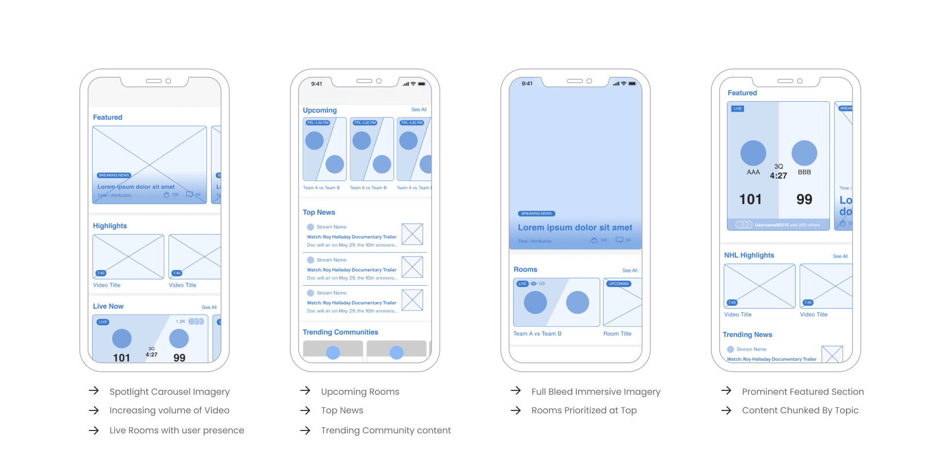
The final design aims to create a more immersive entry-point for fans to draw into content featured and promoted by Bleacher Report. Here are some of the key features of the new design:
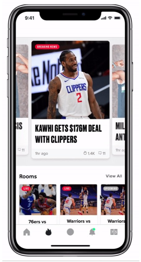
Full-bleed spotlight layout: The spotlight layout features a large, full-screen image that changes based on trending news.
New rooms carousel: The rooms carousel features a selection of rooms that users can join. This makes it easy for users to find and join rooms that are of interest to them.
Trending articles and video modules: The trending articles and video modules feature a selection of the most popular content on Bleacher Report. This helps users to discover new content that they may be interested in.
Final Design
I was excited to contribute to my first project at BR, despite being dropped in mid-flow. I caught up on the product thinking and research work, and collaborated with the team to design a new Fire tab that was more engaging and showcased Bleacher Report content in a more valuable way.
The design process went smoothly, and we met some of the design team's goals. However, user adoption was lower than expected. We could have done more to promote the new tab and encourage users to interact with it.
Overall, I am proud of the work that we did. The new Fire tab is more engaging for users and showcases Bleacher Report content in a more valuable way. I believe that with more promotion, we could have seen even better results.


